Branding your business

If you're interested in creating your own branding for a small business, here is my experience. This is the only time I've been through this process, so it's hardly an exhaustive resource, just one person's individual experience. I hope you find it helpful as a starting point for your own branding journey!
My original Craft & Thrift branding was bought from Etsy, from a small business who design generic logos. I'm not going to link to them here because their customer service wasn't great, but if you're looking for some entry level branding for less than £50, you can search on Etsy for a plethora of options. Most involve taking a generic logo and inputting your text, meaning whilst your logo is specific to you in terms of the wording, the design of it is a formula that can be used by anyone else who buys that listing. I used this for over a year and had thank you cards and branding stamps made from the files I was provided. I think as an affordable initial choice for branding a new business, this is a great option. For me though, the time had come to take Craft & Thrift to the next level and re-branding came hand-in-hand with the process of designing my own website.
I started by creating a Google presentation file I named 'Branding and Business Values'. I took stats gathered from Etsy and Instagram about my follower demographics (age, gender, location etc) and thought about the type of people they are - what are they into? Who else do they follow online? What is important to them when making an online purchase?

I thought about what I was wanting to achieve by re-branding and included that in the presentation. I wanted to ensure that my graphic designer and I were on the same page and working towards the same goals. It also helped me be clear with myself on my aims.

I also thought about my business and what I wanted my business to represent. From here I narrowed down what has ultimately become my business values (you can read more about these on my homepage here) - sustainable, quality and progressive. I view these as core to my business and plan to use them to guide my decision making process in the future. If a business decision doesn't fit with these values, then it's not the right decision for Craft & Thrift. This will help keep me on track with my ultimate goal of running a profitable business, with these values at the centre of everything I do.
Simultaneously, I created a Pinterest board where I saved any and all images I could find online that sparked inspiration. These included colour schemes and other logos, plus photographs and illustrations. Over time I realised a trend was developing, in terms of the imagery and colours to which I was drawn. I input a selection of pictures into my presentation file, as a representation of the type of logo I was looking for.


I also asked my Instagram followers why they followed me and they were very forthcoming with their responses! Again, some themes emerged - sustainability, the environment, thoughtful posts about sewing with secondhand fabric and a general enjoyment of my content. This helped reassure me that I was on the right track, since the images I had saved in my Pinterest board and the values I had come up with for the business, both fit with the responses I was getting from social media.
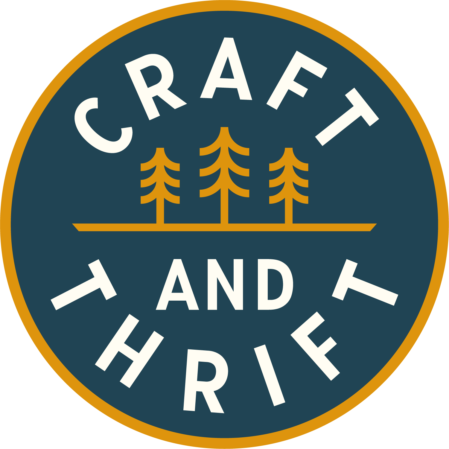
I found my graphic designer, Jose Manzo, on Instagram. In the process of saving imagery that inspired my own branding, I found an outdoor apparel brand based in America. I liked the look and feel of their images and they linked to Jose as being the designer of their logo and tees. Jose is inspired by nature and the outdoors and I loved the nod to vintage camping patches and National Park stickers throughout his work. His style felt exactly what I was trying to encapsulate - gender neutral and minimal, with a nod to the outdoors/nature/sustainability. I contacted him through his website and we started chatting via email.
Once Jose had accepted me as a client, I provided him with the presentation document and we took it from there. Many months of emailing forwards and backwards later, I'm so pleased with the final results. The response from newsletter subscribers and social media has been really positive, which has reassured me that the logo represents exactly what I was hoping. Here's to the next chapter for Craft & Thrift!
